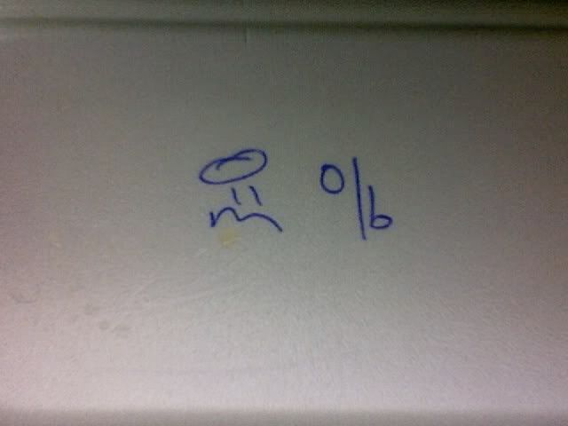
So to keep sane and keep track of the takeout orders, the hawkers developed their own system of symbols to match customers with their respective orders. With a humble ball-point pen, they do a quick visual scan of the customer and scribble on the takeout styrofoam box:
 Aww, isn't that bloody cute?! The angel-in-trouble smiley face is so accidental that it makes me happy. It's accidental things like that that truly constitutes 'happy' design.
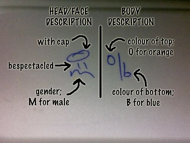
 So I dissect the ball-point scribble:
 Incredible, incredible, incredible! And very clever too! Gender wise, I feel strongly that it's 'M vs. W' rather than 'M vs F'. Man vs. Woman; not Male vs. Female.
The letter 'F' is a hindrance to scribble. 'W' makes for much easier scribbling. Plus, 'W' makes the smiley face smile, don't you think?!

No comments:
Post a Comment